Within a few years, it has become synonymous with bed & breakfast, a name that generically indicates budget accommodation when traveling for pleasure. Like many companies in the technology sector, Airbnb took very little time to assume such an important role in all our lives; in fact, its foundation dates back just 13 years. A result achieved by developing a winning idea and a simple and functional technological platform, but also by building a precise identity around the brand, capable of communicating its values to a global target and turning a more or less amateur website into a hospitality industry giant that today is challenging large hotel chains that have been active for centuries.
This identity took a few years to be defined, and in 2014, it was the focus of a major restyling that involved the logo, the graphics in general, and the tone of voice.
Why are we telling you this story? Because the story of Airbnb’s rebranding clearly shows the work behind the creation of a new image and, above all, the direct consequences that this activity has had on the performance and success of the company founded in San Francisco in 2007.
The story of Airbnb’s rebranding is proof that a good shake-up – understood as a general renewal of a company’s image, the way it presents and tells itself to customers and the world – is fundamental to the success of a business. It is not enough to conceive a product or service better than the competition; to stand out, it is necessary to give it a particular look, to build a context around it that makes it recognizable and elevates it above its competitors.
This is what we mean by the “shake effect,” what we try to do with our clients when asked to develop a communication project. We start from the specific characteristics of a brand, its values, and its strengths, qualities that very often remain more or less hidden from the eyes of the public and potential customers, to build a new image whose main objective is to make these qualities clear and highly visible.
Once upon a time in Silicon Valley…
But let’s go back to Airbnb. Before talking about the rebranding, it is useful to start from the founding story of this company, which has now become a legend in the Silicon Valley environment. Forbes tells us:
“Joe Gebbia and Brian Chesky, graduates of the Rhode Island School of Design, were struggling with rent and asked some people visiting San Francisco for a design conference to sleep on an air mattress on their floor, it was 2007. They then involved a third friend, Nathan Blecharzyck, to help them create a website. Originally called Air Bed and Breakfast, its launch was not a success.
After 12 months, bookings were only 10 or 20 a day. But the trio was already looking for money: in June 2008, they tried to involve seven investors and were rewarded with five rejections and two ignored emails. Their request? One hundred and fifty thousand dollars for 10% of the company, a position that, if not diluted, would be worth more than 3 billion dollars today. The biggest problem was the lack of trust: people were not comfortable inviting strangers they met on the Internet into their homes.”
To solve this problem, the founders began working closely with Airbnb hosts to try to understand how to stimulate people’s trust. They implemented a review system, added 24/7 customer service, and worked on the quality of the website’s images. Also helped by the great crisis of 2008, which forced many travelers to downsize their budgets and many people to put aside the fear of a foreign guest in their home to make ends meet, the listings on the platform went from 20 a day to 500,000 in 2013 (and 5 million in 2018).
Much more than just a logo
At the same time, the company pursued a path of image updating, working to build a strong and recognizable identity. Thus came the first logo change, the choice of a simpler name, from Airbed & Breakfast to Airbnb, and a new platform design aimed at making individual host listings more effective.
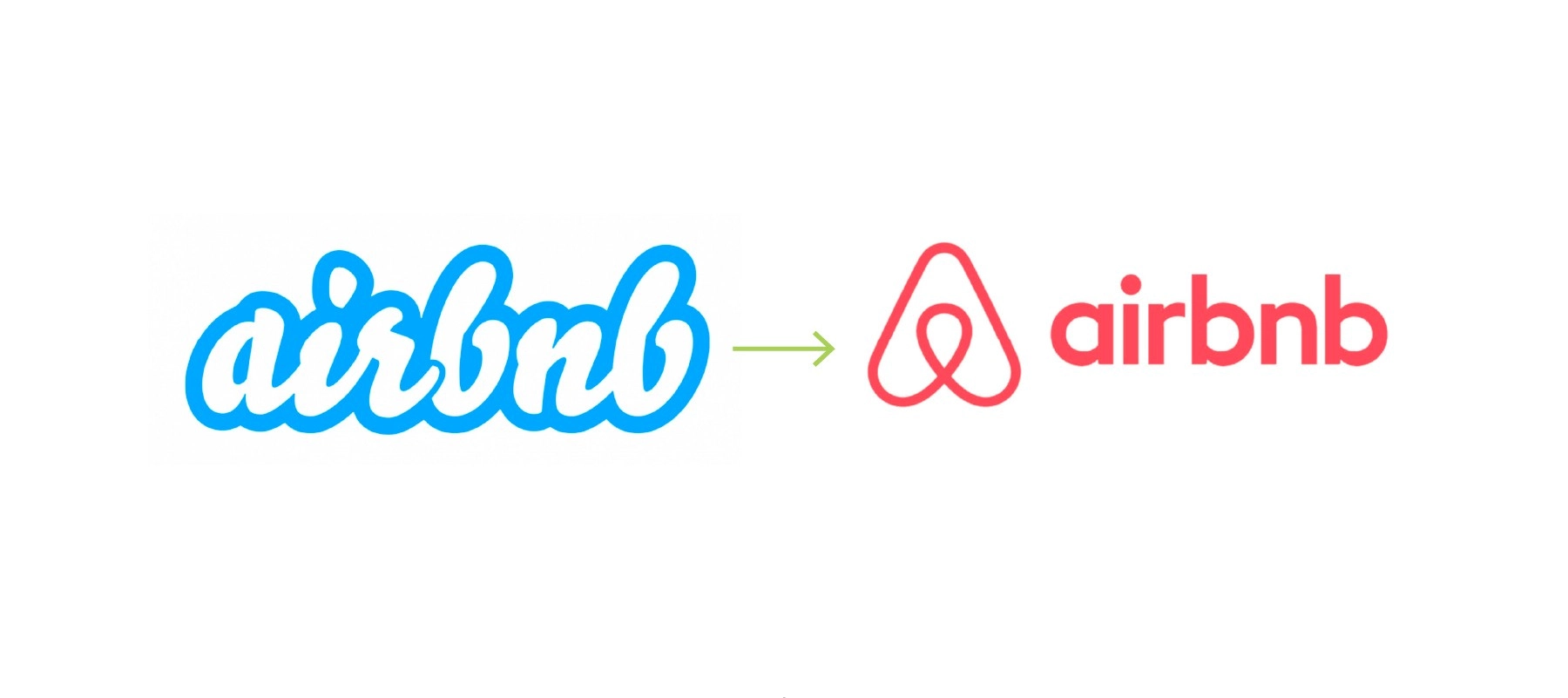
In 2013, the brand decided to push even further in this direction. Motivating the image change was the need to stand out from the main competitors: despite the uniqueness of Airbnb’s offer in terms of quality, its communication did not stand out in the landscape, resulting in substantially identical marketing campaigns. For this reason, CEO Brian Chesky turned to the Design Studio in London to commission the design of a new logo, with the aim of elevating Airbnb to Superbrand status, differentiating it from competitors and increasing its value.
Design Studio’s approach to the project is exemplary for understanding how many elements come into play in the design of a new image for a company, how much work is behind the drawing of a simple sign associated with a text. To create a symbol that would effectively help raise the level of the brand, it was necessary to discover the true and unique identity of Airbnb, a mission that the London studio took seriously.
Four members of the team were sent to 13 cities around the world to visit the locations, meet the hosts, and visit the company’s offices: the best opportunity to get to know the Airbnb community up close and distill its essence. The result of this approach is a new logo that has played a fundamental role in the great growth path undertaken by Airbnb since 2014.
Much more than just a logo
Starting from the premise that Airbnb promised to transform the way people traveled, giving them the opportunity to explore the world not as tourists but always as “locals,” always feeling at home, which in English can be translated with the term “Belong Anywhere.” Thus was born “Belo,” a simple icon that can be drawn by anyone, capable of transcending language and being recognizable in every part of the world, fundamental for a brand that operates on a global scale.
The logo encompasses different meanings: it is composed of a white capital “a” on a red background (the color of the heart, passion, and love), it recalls the shape of an inverted heart, a house, and, in a stylized form, a happy person with raised arms. This can be considered the true soul of Airbnb.
To measure the success of the image change, it is enough to look at the numbers; in the following 4 years, Airbnb’s valuations exceeded those of its main competitor by 29 billion dollars. But Belo also helped define the company’s vision, highlighting the growth opportunities built around the concept of belonging. A concept that inspired the idea of offering experiences rather than simple accommodations, increasingly placing the community at the center and making the fortune of a platform born by chance just 12 years ago.
If you or your company seem like a pigeon but inside you have the soul of a parrot, if you present yourself like a kitten but deep down you have the strength of a lion, it’s time to try the Mentarossa shake effect!
share